Mildura Ski ClubRebranding a Riverfront Icon

A Fresh Look For A Local Legend
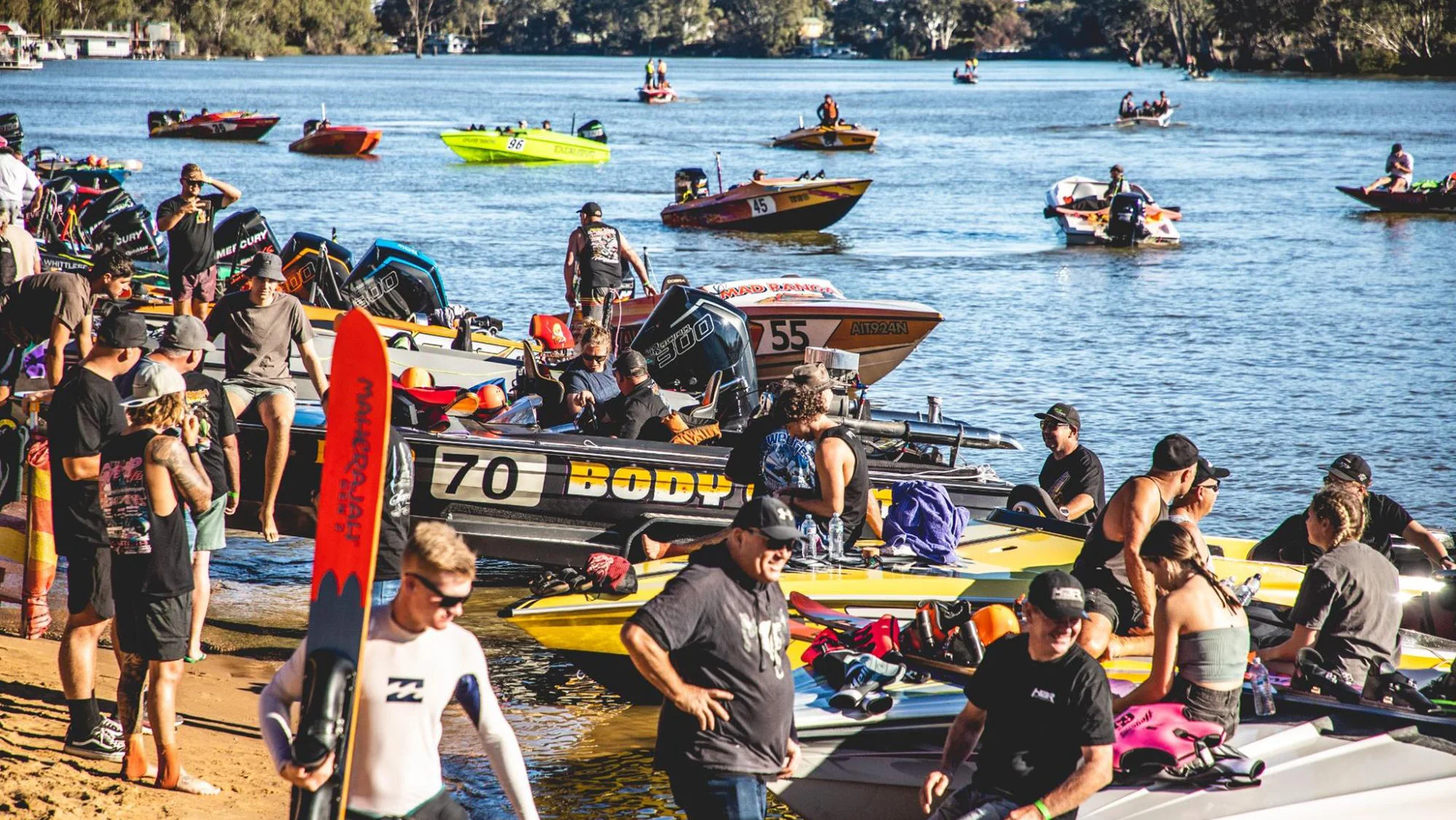
The Mildura Ski Club has long been a cornerstone of life on the Murray—welcoming water-skiers, families, and spectators since 1959. Known for its private riverfront access and as host of the iconic Mildura 100, the club’s history runs deep. But when it came to branding, things hadn’t quite kept up. The club needed more than just a new logo—it needed a clear identity that could carry its story forward and speak to the next generation of members and event-goers. That’s where we came in.
The Challenge
The challenge was to update a much-loved community brand without losing its spirit. The club’s energy, competitiveness, and strong sense of belonging all had to be reflected in the new identity. We worked closely with committee members and key stakeholders to understand what the club meant to its people—past, present and future. This wasn’t about reinventing the wheel. It was about capturing the essence of the club and giving it the tools to stay relevant, cohesive, and confident in a fast-moving, digital-first world.
The Solution
Our solution was a full brand redevelopment that represents the club with clarity and purpose. It’s bold but approachable, modern but respectful of its roots. With this new identity, the club now has a solid foundation to build future campaigns, signage, merchandise, and communications—plus the flexibility to grow and adapt as the membership evolves.

What We Delivered
Brandmark Redevelopment
A bold, modern identity grounded in the club’s history and energy. The new logo is strong, versatile, and works across everything from merch to marquees.
Visual Language
A complete design system that balances sport, nature, and community—including colour palette, typography, and graphic elements that reflect the movement and spirit of water skiing.
Brand Style Guide
A practical, easy-to-use document that ensures the new identity is applied consistently across print, digital, signage and apparel.
Signage
We designed a full signage suite to bring the new identity to life across the club’s riverfront space—building visibility and pride in the brand from the car park to the clubhouse.
Marketing Asset Suite
Templates and layouts for social media, flyers, posters and event promotion—designed to make day-to-day communications easier and more effective.
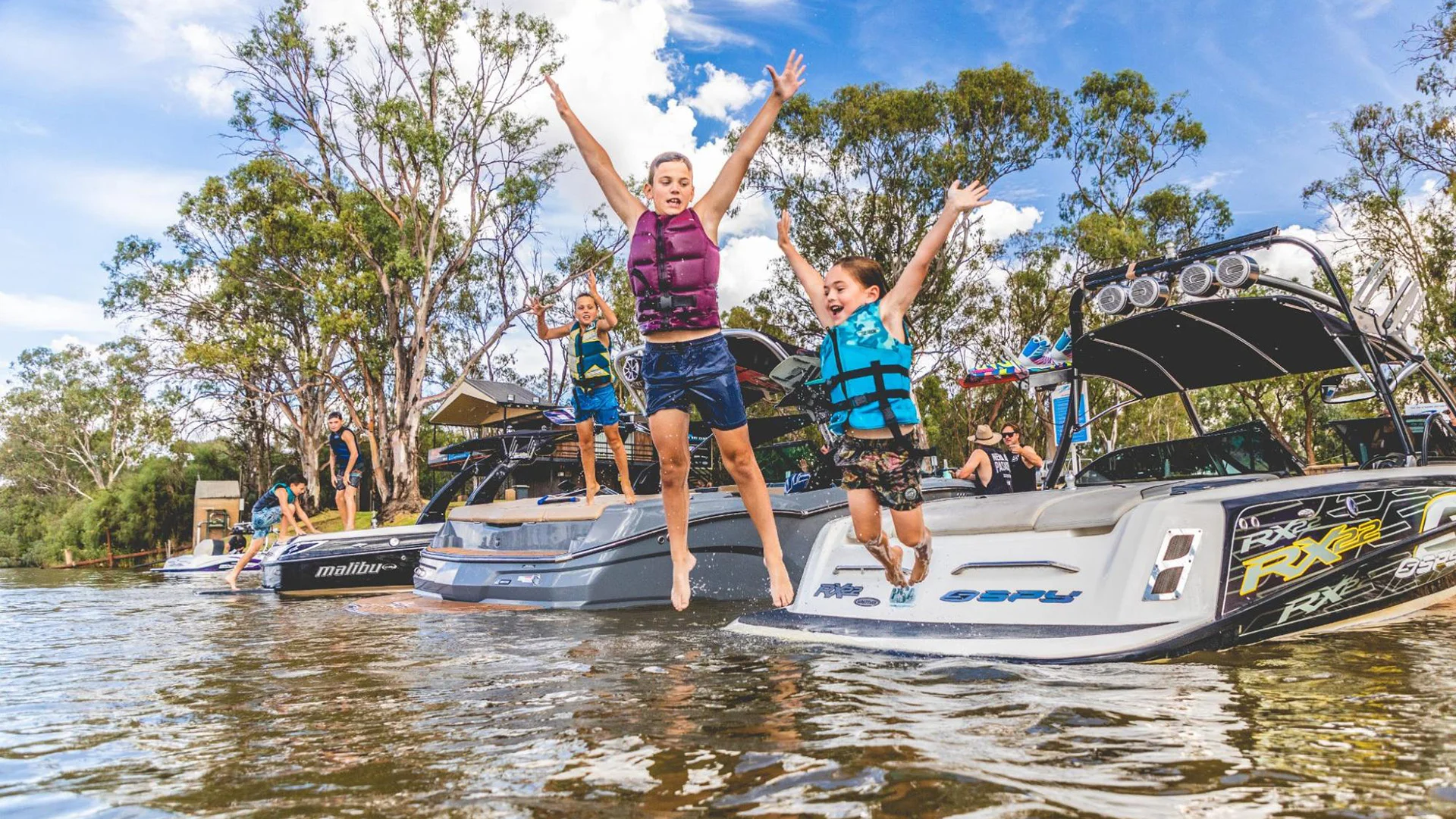
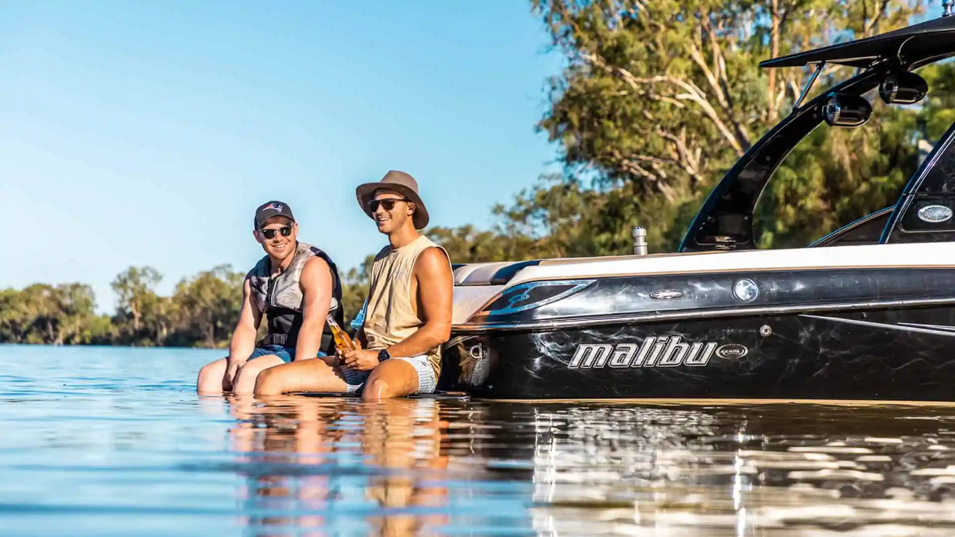
Photography
A custom photo library capturing the club’s people, location and events. These images now serve as the visual heartbeat of all the club’s marketing, from Instagram posts to national promotions.
Website
This project also laid the groundwork for a new website and digital experience, where members can register for events, find key information, and stay connected year-round. You can explore that part of the project over here.
The Results
The Mildura Ski Club now has a clear, confident brand that matches its reputation. One that feels proud, professional, and uniquely local. The new visual identity doesn’t just look good—it gives the club a toolkit to grow, promote, and stay relevant for years to come. Most importantly, it reflects the energy and community that have always made the club something special.